The magic Moody Look with Film
Next to the beloved pastel look you can also achieve a completly different look: the moody look. Its characteristics are its restrained density and saturation.
Before the digital age the combination of film AND paper was deciding for the respective result. One thing that didn’t change is hat Kodak films are warmer than Fuji films (yellowish warm against greenish cold). With the choice of silvergelantine paper you are able to set the contrast and color saturation. A matte paper will show this restraint: a flat contrast, saturated colors but without any shining. At the moment a matte paper for offset print is very popular, like you can see in the current edition of VOW magazine, which shows us a moody look with a classical printing.
Since a lot of old and great papers disappeared from the market we studied this output format in our lab. From now on we will offer next to normal scans and the pastel look this moody look.
As a basis for this look you need to measure on the shadows and set the exposure at the nominal film speed. So do not overexpose like you do it with the pastel look. We will scan the moody look and no postproduction should be necassary.
With this we create a new style of the film characteristics. But you have to communicate with us before your order, because it’s not just a clickable profile. The combination of film, exposure, lens and lighting conditions affects the scan result.
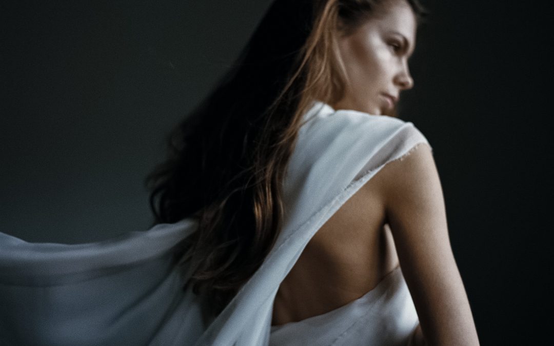
Following pictures are scans from the same negative (Kodak Portra 400 @400)
Photos: Angelika Krinke und Jörg Bergs, Make-up @juliagoetz_makeup I Model @modelwerk @wiktoriafrankowska, Blumen @diekathe

Style: Pastel


Style: Normal


Style: Moody


